


Yerba Madre, Formerly Guayakí, Utilized its Die-Hard Supporters To Ensure a Successful Rebrand
By: DIELINE
Article By Andrew Watman
Published
If you’ve been drinking Guayakí yerba mate beverages for a while, you may not have been surprised when they changed their name to Yerba Madre last week. That’s because over the past year, they removed the name “Guayakí” from the iconic yellow cans altogether, replacing it with the name of the beverage category itself; they just boldly said Yerba Mate.
It was all part of the plan leading up to this rebrand.
Yerba mate is a beverage that’s still somewhat of a mystery to Americans, so when consumers saw Yerba Mate front and center on the packaging, they often thought that was the brand’s name. Even when “Guayakí” was on the packaging, people had so much trouble pronouncing it that they would call it something along the lines of “yerbs” or “the yellow can.”

“People who have known me for two decades still say our name wrong,” co-founder David Karr tells Dieline. Now Yerba Madre’s word-of-mouth marketing will be less confusing simply because consumers will be less hesitant talking about it. Despite its significance, it’s such a subtle change on the surface that many casual customers won’t even realize anything’s changed.
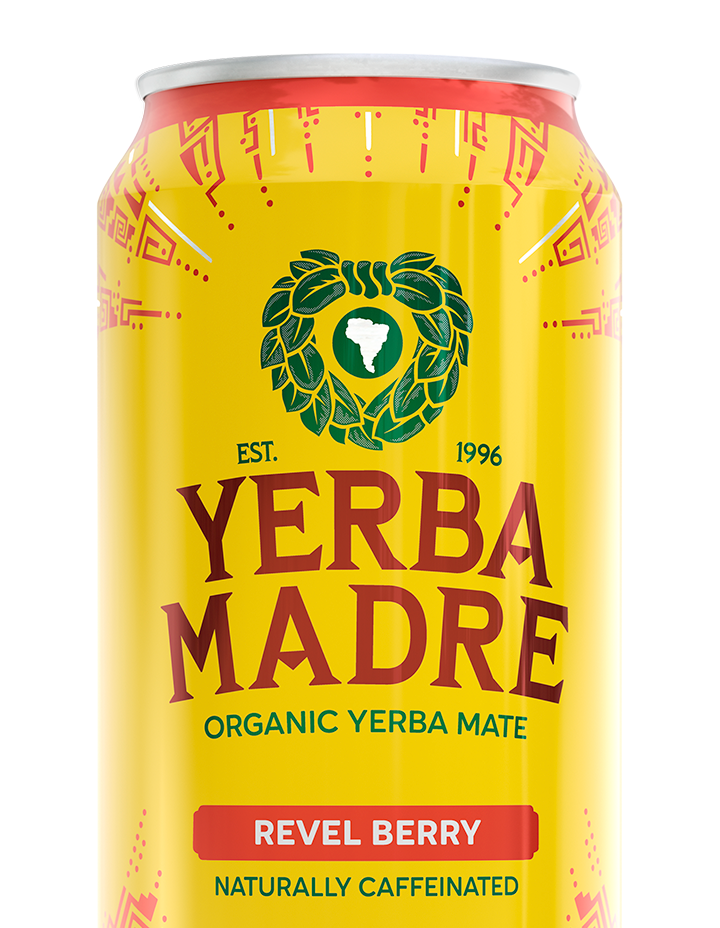
This rebrand doesn’t fit the rulebook of a typical rebrand. If Yerba Madre revamped its logo or changed the color of its cans from yellow, it may have signaled that there was an issue. To have gained such a close association with a color over its 30-year history is quite the accomplishment. There’s no way the yellow was going away. By maintaining the aspects of the brand that its loyal following loves, like the color yellow, the lightning bolts, and even the precursor “yerba,” the brand is signaling that it knows how important some aspects are. This rebrand is simply a name change to reflect the brand’s evolution, which better reflects its mission.


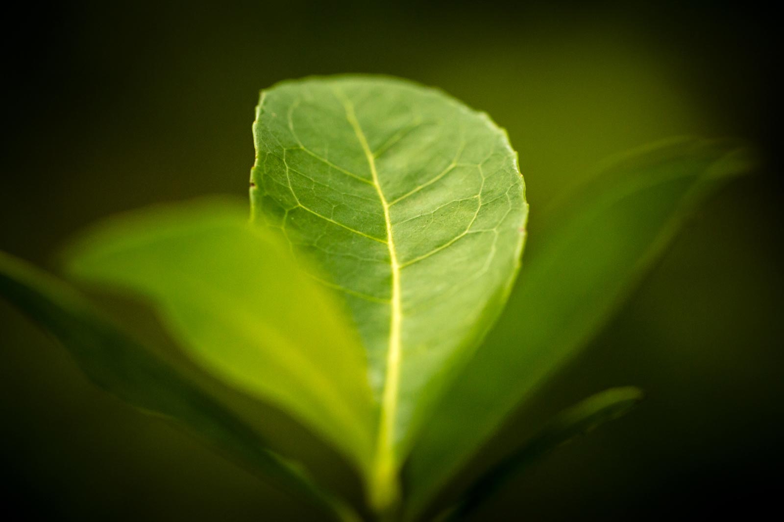
“I didn’t want a flashy, gimmicky name,” says Yerba Madre CEO Ben Mand. “We’re not some energy drink with all sorts of stuff in there. There’s depth to who we are as a brand. It had to be authentic to the plant itself and what we stand for.” It represents all the Indigenous tribes and independent farmers the company has partnered with over the past 30 years since its founding. Aché Guayakí is the historical name of Paraguay’s Aché Kuy Tuve tribe that the company initially partnered with to source its yerba mate. That tribe is still an essential partner to Yerba Madre, but more than 250 other farms are also critical to the company. “We want to be inclusive and reflect all of the communities we work with and pay respect to the plant itself,” Mand says.

Original Packaging
Yerba Madre has garnered an intense fan base over the years, culminating in 2012 with the formation of an official brand-affiliated group called “Ambacebador,” a play on the words “ambassador” and “cebador” (a person who leads a traditional yerba mate gourd circle). “When you build a brand that has such meaning and purpose, it’s not owned by any one person,”says Mand. “This brand is about community and connection, and we felt involving them in that journey was important.”Throughout the past several months, the ten thousand or so Ambacebadors chimed in, taking surveys of different name options and pointing out aspects of the brand they felt most passionate about.
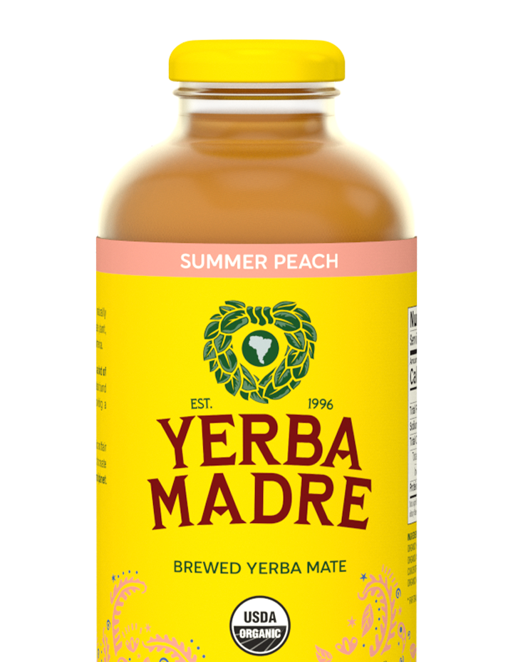
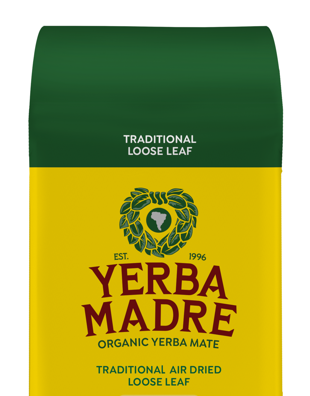
Yerba Madre did not completely overhaul its branding. Most visibly, its bright yellow cans are going nowhere. “The more you change stuff, the more it starts to signal to people that maybe something’s changed about us. That’s not what we want to convey,” Mand says. The cans are still going to create that wall of yellow on store shelves, and consumers are still going to recognize the brand that’s become so closely associated with the color. The wreath logo, originally created by graphic designer and cofounder Steven Karr, is also staying, although he and his brother, fellow co-founder David Karr and internal designer Greg Armstrong did slightly nip and tuck it for the rebrand under Yerba Madre’s Creative Director Ivan Jimenez The yerba mate leaves that make up the wreath have gained some shadows and the Paraguayan flag at the top of the wreath has gone away, another reference to the inclusivity of all of the farms across Brazil, Argentina, and Paraguay that they now work with. The sparkling SKUs of the canned beverage, which feature spiral doodles instead of bolts, are currently being designed with assistance from Voicebox Creative.


Some aspects that Ambacebadors wanted to bring back from previous versions mostly included the tribal-looking doodles. Most of the cans feature lightning bolts, which were reduced in more recent versions. But the company listened to the feedback and added them back to the cans’ top and bottom. “When you think of a lightning bolt, there’s immense power that comes in that, and we think the yerba mate plant holds a lot of power,” Mand says about the significance of the bolt doodles. The bolts are also a nod to the cans having a higher caffeine content than other SKUs. Sparkling versions of the cans will continue to differentiate themselves with swirl-type doodles instead of the tribal lightning bolts.


When the name change became official, the company tried to inform the Ambacebador collective before the news became public. The six founders of the company explained the company’s story and the emphasis on working with South American farmers, leading up to the announcement over Zoom. Co-founder Alex Pryor said in the meeting, “We’re changing because we’ve learned so much more from the plant, where the mate grows, the culture, and the female energy that this plant has,” referring to the seeds that grow only from the female yerba mate plants.

Overall, the news was met with positive reaction from the group. Some negative comments about losing brand identity have sprinkled in, but the co-founders are confident the name will grow on everyone, in the same way it did with them.
Last year, the loose-leaf yerba mate earned a Gold-level Regenerative Organic Certified certification. Instead of hiding it next to the nutrition facts, the new packaging will highlight the ROC certification front and center with the ROC logo on a small gold sticker underneath the name. Not only is this important so that consumers understand the lengths the company goes to support farmers, sustainability, and nutrition, but regeneratively-farmed products are among the fastest growing subcategories in CPG according to SPINS data. More and more consumers are looking for that third-party stamp of approval. Now they will know right away.
Building community, especially for a mission-driven brand, is a means of making others feel like they are a part of a larger movement. In Yerba Madre’s case, they are just as valuable to the company as the farmers who produce the products’ ingredients, feeling a deep connection to every aspect of the brand. The rebrand would not have happened in the way it did without their blessings.
Original article posted on DIELINE here >